Persona – Paul enjoys designing and finding technological solutions

Paul

Paul fair skin wiht brown hair

Age: 19 years

Course: Computer Science 1st Year

Hobbies: Rugby, travelling, films and social life

Background:

Paul really struggled at primary school and never enjoyed writing with endless corrections and not being very dextrous when it came to cursive script.  Eventually his difficulties with literacy skills were assessed and he received some extra help, but he never really talked about his dyslexia and was anxious about the mistakes he made, even though he knew his father had had similar difficulties and ran his own very successful IT company.  However, Paul soon discovered he was in a very different situation on the sports field and any lack of coordination seemed to disappear with the local youth rugby team giving him a chance to shine.  He not only captained the side during his sixth form years, but went on to join the university team in his first year and immediately found friends that allowed him to work around his lack of confidence, when it came to the academic side of things.

Paul not only realised there were others who had similar difficulties with course work and lecture notes.  He also requested extra time to complete written tasks and the use of a laptop as neat handwriting and getting ideas down on paper remained a challenge.  Choosing a science degree made it easier as it fitted with Paul’s strengths. When it came to problem solving, he found he could visualise the whole thing and often see a solution rather quicker than some other students, who took a linear path.  Now Paul openly admits that in his rush to get down his ideas he may make copying and spelling errors and his memory and organisational skills can let him down.  However, he has also learnt a range of strategies built up over time, such as downloading reminder, task and password apps onto his mobile phone.  He uses computer applications that auto-correct and read text aloud, plus looking out for supportive tools that highlight errors when compiling code and making use of graphical interfaces for system and software design.  Paul’s father is an IT systems analyst and computers have always been part of his life.  

Once Paul has a concept firmly in his mind, good analytical skills have meant that he can discuss possible algorithms or practical ways to get something to work.  He really enjoys projects and working with a group, as this allows him time to bring his abilities to the fore, whilst letting others do the report writing and documentation!  

Strategies to overcome Barriers to Access
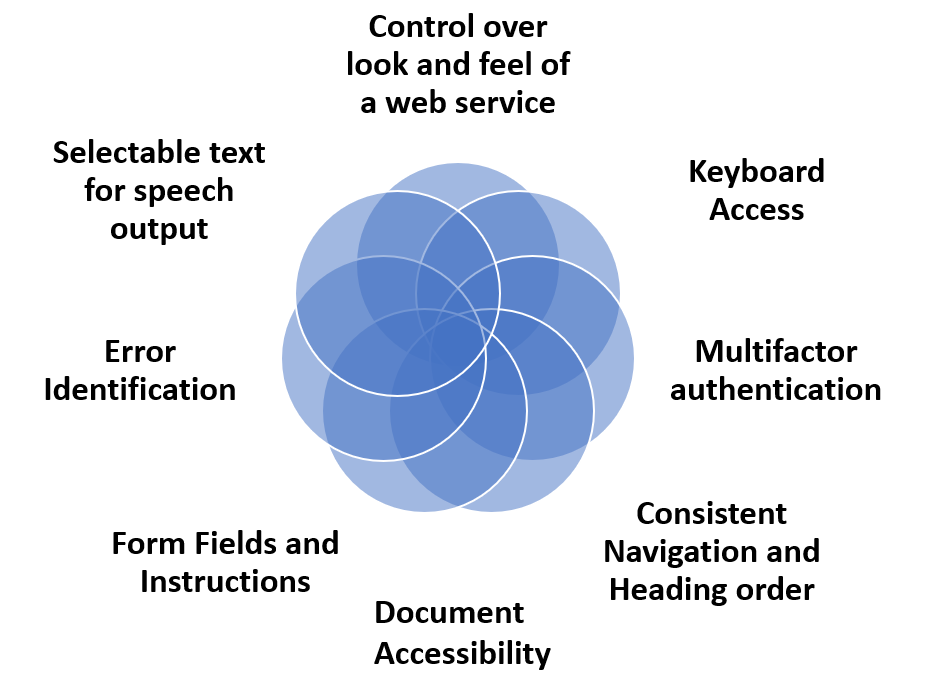
Control over look and feel of a web service 
Keyboard Access
Multifactor authentication
Consistent Navigation and Heading order
Form Fields and Instructions
Error Identification
Selectable text for speech output 
Document accessibility

Multifactor authentication is a challenge especially when copying or remembering passwords is a necessity.  Paul uses the required Microsoft Authentication app for university logins but he largely depends on biometric logins (Android code) or secure second-factor authentication without SMS texts where possible (these are beginning to appear on the web services).  He understands the need for secure VPN requirements when working from home and has set up a password manager as advised by the National Cyber Security Office . He also has several rules to help filter spam emails on an Outlook account.   

When coding he has considered the Web Content Accessibility Guidelines (WCAG) 2.2 Success Criterion 3.3.7 Accessible Authentication as they have the potential to make developers aware of the issues for those who have different types of cognitive impairment including dyslexia.

Keyboard Access is important for Paul as he often uses keyboard shortcuts when writing code having learnt these over time.  He also finds it helpful when considering speech recognition whilst developing websites, as access and navigation can be made much easier (W3C WAI links for keyboard access related to Speech Recognition).

Consistent Navigation (WCAG) and Heading order (Webaim) helps Paul follow the flow of a web site. Clear, well-structured and easy to use menus that are consistent on every page are as much about usability as they are accessibility and the size of the headings with bold text can indicate the importance of content that needs to be read.

Form Fields and Instructions (WCAG) Guidance and clear indicators of what is needed in form fields can enhance completion rates and prevent errors.  Labels need to be near the edit areas (G162: Positioning labels to maximize predictability of relationships)

Error Identification (WCAG)  Any errors that are made should be flagged up with helpful correction notices that do not just depend on colour or cryptic messages.  The latter can often occur when a login is required and the user is none the wiser as to what is missing or incorrect.  At all times error messages must be able to be read aloud with text to speech and be informative.  Mozilla show how an ARIA alert role can be used when a ‘session is due to expire or connection to the server fails’. 

Selectable text for speech output – This is not quite the same as screen reading, where navigational elements as well as content are read aloud.  Paul likes to choose when he wants to highlight text and have it read out.  He can do this easily on his mobile phone with text messages, but finds on some websites and with certain PDFs that text may not be accessible.  Google calls this ‘select to speak’.  It is important to be wary about making text just available for screen readers.  You may present barriers to other users, so make sure visible text can highlighted by keyboard or mouse use when testing for accessibility. 

Control over look and feel of a web service    This can involve customisation as well as personalisation Paul usually adapts the user interface to suit his needs, as well as being able to select different settings in applications.  He sometimes wants to have an overlay to reduce the glare of black on white text and often changes font sizes and styles plus line spacing so these need to be adaptable.  He turns off any animated or timed elements and will stop blinking or scrolling text, as he finds this much harder to read.  He also does not like moving backgrounds or animated non-text elements that cause distractions.   An example of a site that is known for these issues is Lingscars . WCAG Success Criterion 2.2.2 Pause, Stop, Hide (Level A)

Document accessibility is important for everyone and when Paul uses his text to speech apps he expects to be able to have content read aloud at any speed in an order that makes sense, with a voice of his choice.  WebAim have an easy to follow set of instructions for making ‘Accessible Documents: Word, PowerPoint, & Acrobat’.

Key points from Paul

I like to understand what a web site or service is about immediately! If it is cluttered and I have to navigate through several layers to get to content I give up. Keep it simple is a good motto for me because I am impatient and don’t want to read long introductions.  Just give me a one liner and a diagram or picture that says it all!”

If you have a moment think about reading “Making Content Usable for People with Cognitive and Learning Disabilities” (W3C Editor’s Draft 21 September 2021) where the authors have provided a design guide that includes eight objectives namely:

  1. Help users understand what things are and how to use them
  2. Help users find what they need
  3. Use clear and understandable content
  4. Help users avoid mistakes and know how to correct them
  5. Help users focus
  6. Ensure processes do not rely on memory
  7. Provide help and support
  8. Support adaptation and personalization
Website accessibility testing – readability, colour contrast and dyslexia – Access iQ™ 4.51 mins (2012) YouTube https://youtu.be/TCCtaTz_4VU

Paul Crichton 2019 on UserZoom “Five ways to make your digital content easier to use and understand for people with dyslexia. ”How to make better websites for people with dyslexia

Professor Stein’s article on the BCS website, The Chartered Institute for IT  Why dyslexics make good coders

Persona – Faith keen to explore the use of virtual reality and accessibility

Faith

Age: 53 years

Course: Computer Science 3rd Year

Hobbies: Garden design, family and video games

Background:

Faith recently had COVID-19 and this really affected her arthritis.  She felt so tired and upset at times.  She was very upset that all her work was being affected by feeling as if she had brain fog, as well as having depleted levels of concentration.  On top of all the COVID challenges, she developed repetitive strain injuries (RSI) trying to cope with her studies as well as life in general.  Despite the fact that Faith’s family were now away from home much of the time, she was struggling but determined to finish her third-year project that involved access to virtual worlds with the development of three-dimensional (3D) Internet environments.   This was exciting, interesting but a challenge with a write up, as well as all the coding.

Having been an administrator, she had been bored with the endless spreadsheets and databases and decided to return to her love of mathematics and design rather, than looking at poorly developed user interfaces.  She wanted to be more creative and create ideas around virtual worlds that involved outdoor environments and in particular intricate garden designs, as this had become more than just a hobby.   However, as her arthritis progressed and now her RSI was really affecting her dexterity, she was concerned that she would not be able to cope with so much mouse work, such as click and hold to grab a screen or multiple clicks to drag and drop items. 

Taking breaks had become essential and accessing controls via keyboard shortcuts seemed to help, but the latter was not always possible when creating demonstration applications.  Faith found she needed to use her left hand more and keep her right forearm in the handshake position to prevent the RSI pain.   Using an upright mouse with a roller ball on the side or a pen stylus solved some issues.  She really liked to be able to step through her worlds using single keys to move around and had her Mac set up with several personalised keyboard shortcuts using Control accessibility options with her keyboard.  Speech recognition was good for much of Faith’s writing, when she used the dictation settings and Voice Control for the main navigation challenges on the computer.  However, remembering all the commands was hard, so Faith resorted to a crib sheet!

Main Strategies to overcome Barriers to Access

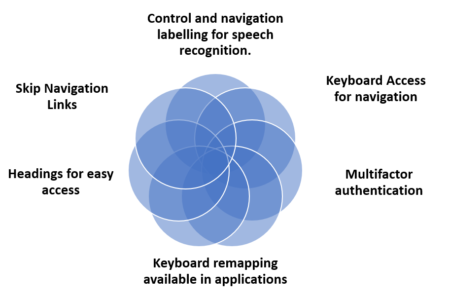
Control and navigation labelling for speech recognition. 
Keyboard Access for navigation
Multifactor authentication
Keyboard remapping available in applications 
Headings for easy access
Skip Navigation Links

Strategies to overcome Barriers to Access

Multifactor Authentication. Faith finds fiddling with two devices really difficult especially when she is then required to copy a code or manage a series of numbers. She much prefers to use biometric forms of verification, such as speech, face or finger recognition; her computer and phone have her preferred finger recognition. At the moment she cannot remember passwords or phrases let alone three random words. Faith has to cope with the Microsoft authenticator app to access university sites and has a password manager system for online access. (Web Content Accessibility Guidelines (WCAG) 2.2 Success Criterion 3.3.7 Accessible Authentication)

Keyboard Access  “Speech recognition can be used for dictating text in a form field, as well as navigating to and activating links, buttons, and other controls.” (W3C WAI speech recognition accessibility) The link to making this possible is to ensure that all these controls are keyboard accessible and then the mapping of the commands will work with voice controls.    Example of how other criteria linked to WCAG compliance help solve the challenges faced by Faith

Keyboard remapping available in applications in order to personalise keyboard controls and make it easier to access app components.  The WebAim team provide a very useful table that covers the standard keystrokes that Faith uses for the browser interactions, with hints that enhance accessibility.  

Control and navigation labelling for speech recognition.  The way controls are labelled can make all the difference when accessing sites using a keyboard or speech.  Faith finds she has to use her spoken command crib sheet more and more to access controls and to navigate around pages if she cannot use her mouse and these commands depend on the labels that have been used by the developer.

Skip Navigation Links  can be really helpful when wishing to get to the main part of the screen rather than having to tab all the way around and for Faith it is important that she sees this feature as she does not use a screen reader (Webaim guidance).  WCAG Success Criterion 2.4.1 Bypass Blocks  “Because navigating by headings or regions is not supported in most browsers, WebAIM recommends a “skip” link (in addition to headings and regions) to best support sighted keyboard users.”

Headings for easy access.  This is not just about using consistent Heading order but being clear about titles and their meaning to help Faith quickly scan down content especially if there are important instructions.   This can help her concentration as well as make it easier to navigate.


Key points from Faith

“The worse thing is that I have to take regular breaks now because my concentration goes and I know if I spend more than half an hour continuously using my mouse I will be in pain for the rest of the day. I really want technology applications that are used for designing and developing apps to be more accessible as well as the apps themselves”

AbleGamers have produced a really helpful guide for developers about making ‘Accessible Player Experiences (APX)‘ that can be applied for any app development.

Speech recognition on Mac YouTube Using Voice Control To Click and Drag With Speech Commands

Accessibility Considerations for Augmented and Virtual Reality for the Classroom and Beyond from the Bureau of Internet Accessibility (USA)

Persona – Carlos as a bilingual computer science student

Carlos

face view of Carlos from Spain with brown hair, light brown skin  and brown eyes

Age: 20 years

Course: Computer Science 2nd Year

Hobbies: Running, coding, socialising with friends and family

Background:

Carlos has been blind since birth and does not see light from dark or colour and admits that even when he rubs his eyes, although the feeling may change, there is nothing but an acute sense of things around him.  Navigating with a cane and managing independently on the university campus is nothing new to him, as he has travelled extensively.  Carlos is bilingual and has no problem switching between his native Spanish and the English language.  He is an adept screen reader user and multitasker, picking out voices of those he knows immediately they come within hearing distance, even whilst working on his computer!  A love of technology has always meant that he tries out the latest versions of applications on both desktop and mobile devices, making use of Windows with a JAWS screen reader and the latest iOS phone and Apple watch.   During his computer science course, he has been known to seek out bugs that cause barriers during lab sessions and is keen to see an increase in the understanding of digital accessibility by explaining issues to his fellow students.  He has also helped with several WCAG evaluations of web sites and applications, but often finds the hardest systems to access are those linked to online learning, because they require so many different interactions.  Carlos depends on speech synthesis to read out texts at speeds of around 450-500 words per minute (rather than using Braille), he skips through navigational elements, menus, forms and modal windows to actual articles, in the hope of finding an order that will give him a feel for the way a site or service is being delivered.  The keyboard or gesture input with short cut actions, heading selections and use of context sensitive links, allow him to memorise the layout of a new website alongside search results when looking for content or files.  Carlos often uses his mobile for certain online services, where apps may be less cluttered and easier to navigate.

Main Strategies to overcome Barriers to Access

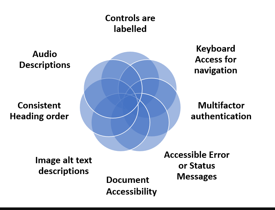
Controls are labelled
Keyboard Access for navigation
Multifactor authentication
Accessible Error or Status Messages
Image alt text descriptions
Consistent Heading order
Audio Descriptions
Document accessibility

Multifactor authentication on login has become necessary as part the university’s security system and Carlos has to juggle between an initial password, then the use of mobile authenticator apps, SMS or knowledge-based challenge questions and even biometrics depending on the various services.  These are usually accessible to a screen reader, but mistakes when there is lack of helpful feedback, can make the process very frustrating. (Web Content Accessibility Guidelines (WCAG) 2.2 Success Criterion 3.3.7 Accessible Authentication)

Keyboard Access for navigation is essential for Carlos as he does not use a mouse.  Hedepends on tab order following the visual flow of a web page when first entering a site.  Interactions may include links, buttons, fields for inputting text with forms and modal windows (ARIA: dialog role accessibility). The WebAim team provide a very useful table that covers the standard keystrokes that Carlos uses for the interactions, with hints that enhance accessibility.  

The way controls are labelled can mean all the difference when using key strokes to play media, filling in forms and downloading content.  Carlos described the need to have easy to reach microphone /audio controls, recording start, pause and stop buttons and to be able to request attention and use of the chat without affecting accessibility of other aspects of a video conference.

Consistent Heading order is also crucial, as Carlos steers his way through headings and subheadings when quickly checking out the content on a page. Short cut keys used by most screen reader apps provide a quick list of the heading, region and list structures e.g. example key strokes for  NVDA or a cheat sheet for iOS with gesture and rotor use for headings

Image alt text descriptions are important when an image complements the meaning of content or the function and needs a few explanatory words.  Carlos finds it very annoying when an image has no alt attribute and is read as a long file name that means nothing.  So it is important to decide whether an image is essential for helping understanding or function or just decorative and can take a null alt (alt=“”) attribute.

Accessible Error or Status Messages are so important to screen reader users, if nothing is heard and only seen visually, it is extremely frustrating and even more so it the pop up prevents further navigation.  Carlos has experienced times when he has had to just back out of the service wondering what had happened. For instance, when he submitted a form and did not realise he had made a mistake.  At all times error messages must be read aloud and be informative.  Mozilla show how an ARIA alert role can be used when a ‘session is due to expire or connection to the server fails’. 

Audio Descriptions are something that Carlos often uses when watching TV, as they explain what is happening on screen.  This may not always be necessary for videos of lectures or face to face discussions.  However, when a caption just reads aloud ‘music’ or ‘silence’ and the video is still running, Carlos described how useful it is to learn about the movements occurring or even the body language and wondered if it would be possible to use YouDescribe with a free account to link to a YouTube video.

Document accessibility remains a challenge for Carlos and becomes exasperated by the number of academic papers that are still hard to access.  He prefers Microsoft Word to PDF as the reading order tends to be better, but once again without correct structure and logical use of Headings it can take longer to navigate long texts.  WebAim have an easy to follow set of instructions for making ‘Accessible Documents: Word, PowerPoint, & Acrobat’.

Key points from Carlos

“Be consistent and offer a logical structure to all navigational elements, throughout the various parts of the interactive online eLearning experience”

As an aside if you are interested in learning how Carlos copes with programming on his Computer Science course here is a YouTube video from Mega T. Garrett, (13.37mins) describing his techniques for working with the JAWS screen reader and Java  “True Blind Q&A* How Does a Blind Person Program (Java: Hello World)”

WebAim Screen Reader User Survey #9 Results “In May – June 2021, WebAIM surveyed preferences of screen reader users. They received 1568 valid responses. This was a follow-up to 8 previous surveys that were conducted between January 2009 and September 2019″. The survey can be used to see which elements of web accessibility are important and how 1568 screen reader users choose to surf the web.

If you are developing using ARIA and have not seen WhatSock’s Apex 4X – there is a download for their template design patterns on Github, distributed under the terms of the Open Source Initiative OSI – MIT License, and may be freely used for any purpose within any web technology.

Persona – Amber, activist for inclusive education.

Amber

young female face with whispy hair eyes looking down

Age: 23 years

Course: Computer Science 2nd Year

Hobbies: Yoga, running, actively taking part in lobbying for inclusion

Background:

Amber loves her yoga and running, excelling at school where she enjoyed an inclusive educational setting despite her severe bilateral hearing loss.  She is a hearing aid user and depends on lip reading (speech reading) and Sign Language, but speaks relatively clearly.  In fact, her communication skills are remarkable, thanks to the early and continuous support she received from her parents, both mathematics professors.  Nevertheless, being at university was quite a challenge in the early months.  She admitted to feeling isolated, but used her yoga and cross-country running activities to get her through.  She explained that the psychological and emotional feelings were almost more challenging than dealing with lectures, tutorials or trying to access support, plus she missed her family and friends in the Deaf community.  It was the constant need to explain to people why she had not heard them or put up with their replies “Oh it doesn’t matter, it’s not important” if she queried what had been said – her disability was non-visible The process of disambiguation can be very tiring and as Ian Noon said in his blog

“Processing and constructing meaning out of half-heard words and sentences. Making guesses and figuring out context. And then thinking of something intelligent to say in response to an invariably random question. It’s like doing jigsaws, Suduku and Scrabble all at the same time.”

Amber joined the Student Union and found fellow activists who became friends as well as lobbyists for disability awareness and more inclusive teaching practices.

Those who could use sign language were rare, although help was available from interpreters during lectures and at other times, from note takers.  Sometimes, Amber depended on fellow students’ notes, because it was hard to write, as well as concentrate on the lecturer or interpreter.  Giving a lecturer her FM transmitter and microphone helped, especially when they turned away to write on a board or there were discussions and noise levels were raised.  When lecture capture was in use, Amber always hoped the Automatic Speech Recognition (ASR) would provide good quality closed captions and subject specific words would be transcribed correctly.   During the COVID-19 pandemic, Amber used text-based Q&As and comments when events happened in real-time with captions or subtitles and transcripts if available.  Downloadable summaries and slide notes provided details missed on the video recording. Help and documentation about caption position adjustments, the text size and colour plus other settings for the conferencing system and access to a glossary of important subject related vocabulary has also been invaluable to aid comprehension.

Main Strategies to overcome Barriers to Access

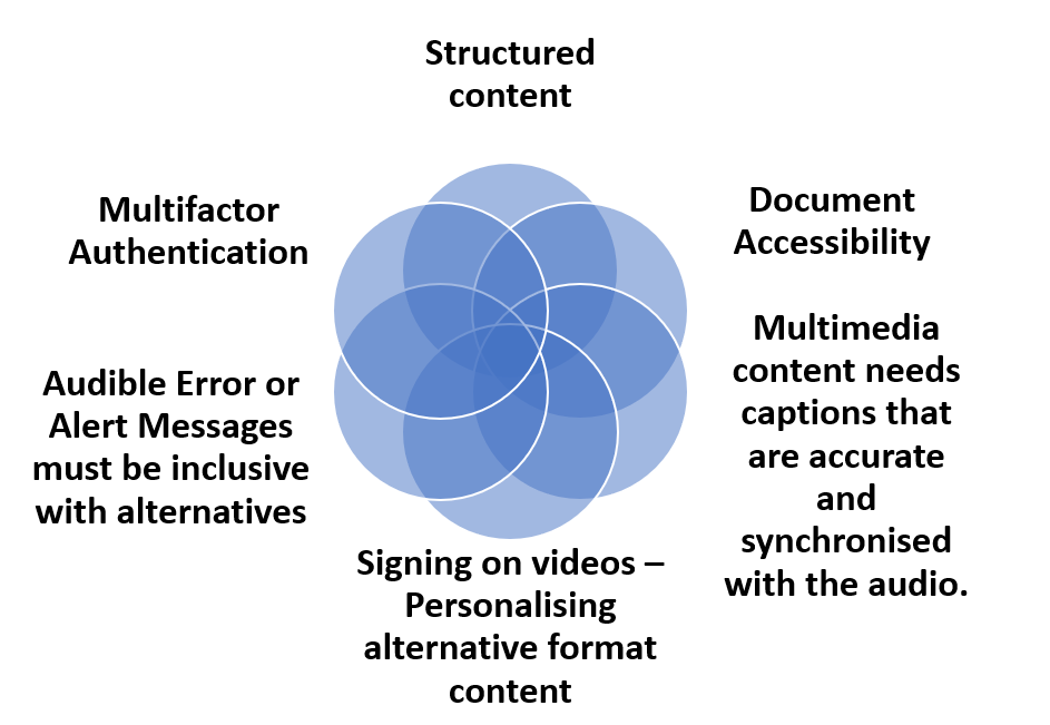
Structured content 
Signing on videos – Personalising alternative format content
Multifactor authentication
Document Accessibility
Audible Error or Alert Messages must be inclusive with alternatives
Multimedia content needs captions that are accurate and synchronised with the audio.

Multifactor authentication Amber has found that the best way for her to overcome the multifactor authentication issues is to use text messages (SMS) with a onetime password (OTP) plus a smart phone app.  She has also found that finger biometrics on her phone helps with authentication or using an email system.  She has a card reader for her bank but does not use speech recognition or voice calls for any verification, as she is never sure if she is going to get an accurate result or hear everything. (Web Content Accessibility Guidelines (WCAG) 2.2 Success Criterion 3.3.7 Accessible Authentication)

Multimedia content needs captions that are accurate and synchronised with the audio. Video and audio output complement so much of web content and Amber depends on good quality alternatives to make services both usable and accessible. It is not just the content, but also the way players work and the fact that any audio needs to be controlled and not start automatically.  WCAG Guideline 1.2 – Time-based Media discusses content challenges and User Agent Accessibility Guidelines (UAAG) 2.0 provides technical details for developers such as Guideline 1.1 – Alternative content. The Authoring Tool Accessibility Guidelines (ATAG) also for developers and designers include the following guides related to those who have hearing impairments:

Signing on videos – Personalising alternative format content.  Being able to adjust the position of the window with interpreter signing and/or captions may be important when content is filling the screen in different places as seen in the YouTube lecture on Beginning Robotics provided by University of Reading.  Further guidance is available in their blog on Personalisation of viewing

Structured content is important for everyone and helps Amber when she needs to pick out key topics.  So clear headings and sub headings, use of white space and links to summaries, especially if they are related to video and transcript content, so she can see what is relevant to her needs.   So regions, headings and lists all help to make a content more understandable.

Audible Error or Alert Messages must be inclusive. Notifications need to be available as very visible alerts as well as being audible and, on a phone or electronic watch, this can also be via vibration.  

Document accessibility is important whether it is related to providing summaries and clear language or heading structure and bullet points, the aim is to make documents usable as well as accessible.   WebAim have an easy to follow set of instructions for making ‘Accessible Documents: Word, PowerPoint, & Acrobat’.

Key points from Amber

“I am a very visual person and I like to see a detailed process as a diagram or image – step by step.  I also really like having PowerPoint slides with all the main points…”

Interviews with Three Deaf Software Engineers in Bay Area (USA) Facebook video

TPGi provided a very helpful set of articles around an interview with Ruth MacMullen, who is an academic librarian and copyright specialist from York in the UK, called  “Sounding out the web: accessibility for deaf and hard of hearing people”  Part 1 and Part 2

The latest version of the iPhone operating system iOS 14 offers more accessibility options and personalisation with increased use of visual and vibrating alerts and further support for hearing aids

The “PacerSpacer” – Simplicity in Controlling the Pace of Presentation Software (like PowerPoint) “One of the most important things you can do for Deaf/HH audience members when using presentation software such as PowerPoint is to allow sufficient time for them to read the slides before you begin talking. For Deaf/HH individuals, this means allowing time for them to stop watching the interpreter or you, switch their attention to a slide, and then return their attention to either the interpreter or you. With an interpreter, even more time is required since there is a lag time between what you say and the signing of that message.” DeafTec, Rochester Institute of Technology (USA)

Persona – Eum, a would be computer scientist who needs magnification

Eum

Full face view of Eum of Asian origin with dark heair and eyes

Age: 21 years

Course: Computer Science 1st Year

Hobbies: coding, cooking and travelling

Background:

Eum developed glaucoma meaning that as his peripheral vision has deteriorated and his central vision has become foggy, he spends more time zooming in to read text rather than zooming out. He has had to depend more and more on assistive technologies to help with his computer science studies, having changed his plans that were to become a chef.  Eum loves cooking, but the stress of a restaurant kitchen coping with lots of unexpected obstacles became too challenging.   As time has passed he also found he does not always recognise faces or signs in the distance.  He tends to trip up on curbs or steps, especially when it gets dark or there is low lighting, however, this has not stopped his love of exploring new places when on holiday with family. 

Reading can be difficult without careful targeted magnification and he tends to set up his two computer screens with good contrast levels for black on white text or other high colour contrast options, whilst trying to reduce reflections from windows and lights. At times he finds it easier to move the text in front of his eyes rather than scanning across text because of his reduced field of vision and the depth of focus on individual sections of text needed.   Time is often an issue as assignments tend to take longer to complete when reading only a few letters in one glance.  Eum uses a magnification cum screen reading program on a Windows machine, so that he can access various arrow heads, crosshair and line cursor sizes with focus tracking.  The latter means that items are magnified as he moves across and down the screen.  A high visibility keyboard helps, as does his portable magnification stand for reading paper-based materials. 

Although Eum uses audio books on his tablet for listening to novels, he prefers to read academic papers and notes on his computer, where he can add annotations.   Messaging and emails using his smart phone are quicker with speech recognition and text to speech output, although Eum does not depend totally on the screen reader technology for navigation.   He has learnt over time where items are to be found and is very disciplined about how he personalises his desktop and filing system on all his devices.  As a computer scientist in the making, Eum has become adept at changing browser settings with ad blockers and other extensions, but this does not compensate for the clutter he finds on many web sites.  He becomes frustrated when developers fail to realise the importance of avoiding overlaps and disappearing content when sites are magnified.  He feels scrolling horizontally should not be necessary on websites especially when form filling, as this is a particular challenge with text fields or modal windows that go missing or where there is no logical order to the layout.

Main Strategies to overcome Barriers to Access

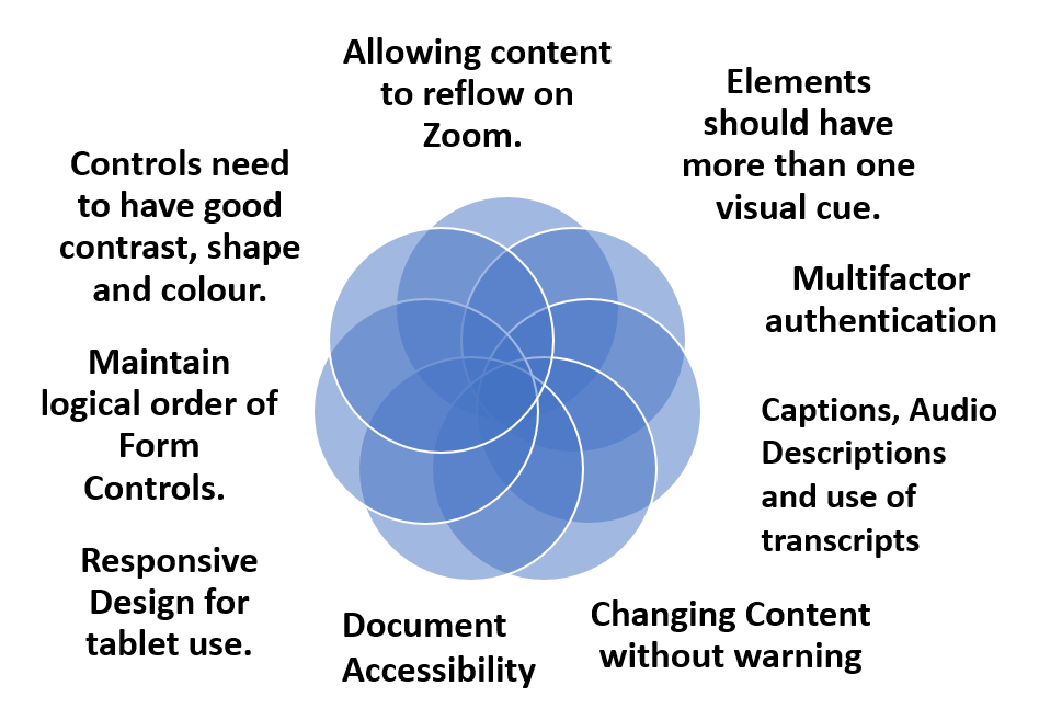
Controls are labelled
Keyboard Access for navigation
Multifactor authentication
Accessible Error or Status Messages
Image alt text descriptions
Consistent Heading order
Audio Descriptions
Document accessibility

Multifactor authentication for password verification.  Eum usually manages the initial password and use of mobile authenticator apps, SMS or knowledge-based challenge questions better than the grid style image or Captcha options. Time can be Eum’s real problem if he has to cope with different types of authentication where items disappear before he has had a chance to memorise or note down the code.  He cannot use retina-scan technology, but finger and speech recognition work well.  (Web Content Accessibility Guidelines (WCAG) 2.2 Success Criterion 3.3.7 Accessible Authentication)

Keyboard Access for navigation helps Eum as he has memorised many short cuts when surfing the web and finds it easier than mouse use when he has to track the arrow head or cursor.  He depends on web pages appearing and operating in predictable ways (W3C WCAG Predictable: Understanding Guideline 3.2).

Allowing content to reflow on Zoom.   Eum reads magnified content using large fonts that need mean a page has to reflow vertically (as a column) and remain fully legible and logical without the need for horizontal scrolling (W3C WCAG 1.4.4 Resize text (Level AA)). User agents that satisfy UAAG 1.0 Checkpoint 4.1 allow users to configure text scale.

Maintain logical order of Form ControlsEum benefits from the logical order of form controls with labels close to the fields to which they relate so that the flow is vertical on magnification rather than horizontal.  Dividing forms into small sections when they are long or complex with clear headings really helps.  However, careful checks need to be made with borders of buttons etc so that they do not overlap other controls or disappear from the screen with high levels of magnification.  

Controls need to have good contrast, shape and colour. Text needs to be distinct. The importance of contrast levels for all aspects of a service cannot be stressed too highly and yet it is often one of the items that fails in accessibility checks. Webaim provide clear guidance Understanding WCAG 2 Contrast and Color Requirements.  It is also vital that text and images of text are distinct from their surroundings – WCAG SC 1.4.3 (Contrast – Minimum)

Elements should have more than one visual cue. Eum finds it really helps when he is selecting features on a web page to have icons, colour as well as text such as when there is an alert.  Underlined text should just be used for hyperlinks.  Links and other actionable elements must be clearly distinguishable.

Changing Content without warning.  Because Eum uses assistive technology, whether it is his magnification software or speech recognition, he finds that any visual changes that occur to the interface or actions that happen without the page refreshing can cause problems.  He needs to be notified about the changes W3C WCAG 2.0 Name, Role, Value: Understanding SC 4.1.2 and there is also the need to Understand Success Criterion 4.1.3: Status Messages.

Responsive Design for tablet use.  Eum likes to use his tablet, but has to depend on its built-in access technologies and the responsive design for accessibility provided by the developers of web services as well as their customisable options.  He relies on a consistent layout throughout a web service with sufficient space between interactive items such as buttons.   A11y project mobile and touch checklist for accessibility.

Captions, Audio Descriptions and use of transcripts.  Videos can be very tiring to watch and so Eum uses captions with high contrast colours to make them stand out more against the background of the video images, using highlighter systems to mark key points in the transcripts and depends on audio descriptions if scenes are not well described in the commentary on the video.

Document accessibility whether online or as a PDF download or other format, Eum needs to make changes to suit his narrow field of vision.   WCAG Understanding Success Criterion 1.4.8: Visual Presentation has some useful guidance.  WebAim also have an easy to follow set of instructions for making ‘Accessible Documents: Word, PowerPoint, & Acrobat’.

Key points from Eum

“Allow for magnification with zooming in to read text in small chunks, taking care to make visual presentation as logical as possible for vertical scrolling preferably in one column layout”

Designing and Coding for Low Vision” featuring Mallory van Achterberg is a really helpful YouTube video where he says ‘If I cannot see it, don’t let me tab to it” plus lots of other helpful comments, as a coder who uses magnification.

There is a useful document called  “Accessibility Requirements for People with Low Vision” created as a W3C Editor’s Draft (04 November 2021)

Multifactor Authentication – Cognitive overload?

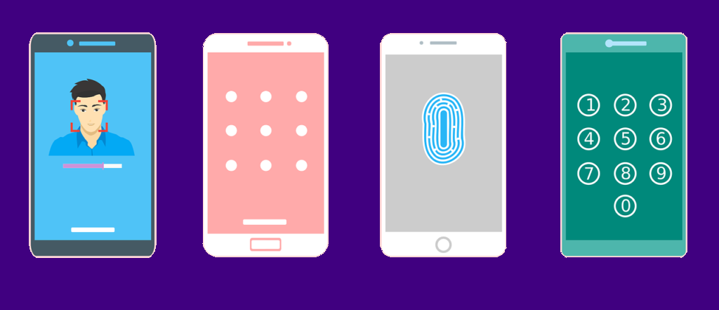
smart phone face recognition, code, finger print and numeric password screens.

Recenty the FBI warned that cyber thieves are finding ways around multifactor authentication protections. We may not own crypto accounts, but universities across the UK have implemented forms of two or multi-factor authentication to protect our accounts and we are grappling with strategies to ensure accessible forms for verification are available. The W3C WCAG Cognitive and Learning Disabilities Task Force has published an Accessible Authentication (User Story) to illustrate the need for the cognitive function test mentioned in the previous blog. It also highlights how memory impairments and difficulties with executve function can make MFA a challenge as well as time constraints.

There was a Twitter stream in February 2021, that highlighted more reasons why some of the MFA choices offered may not be helpful to individuals with Autism and Attention Deficit Hyperacive Disorder (ADHD). Devon Price’s insight into the frustrating nature of these extra levels of security illustrates the cognitive overload that can occur when several tasks have to be completed with multiple devices or systems.

key fob

If you do not have an external code device, the choices tend to centre around the use of a personal mobile phone. Having checked the websites of 50 universities it appeared that 42 (84%) advised students to use an authenticator app – usually Microsoft, that also offers a Self Service Password Reset. Other options were the Authy, Google, Sophos or Duo apps. All the university systems still require the user to remember passwords with the extra verification and then encourage a back up option via SMS, a phone call and some mentioned a landline or email. Only 4 universities offered a choice of two authentication apps and just 7 mentioned the use of a fob or external device, although one said this would not to work with Virtual Personal Networks. Preference for Authy as an alternative was mentioned in a question about the Microsoft Authenticator, as this can be used on a desktop computer. At the time of writing Microsoft Authenticator instructions do not mention a desktop verification option to their MFA.

Some universities in the small study used the Microsoft instructions, but when searching for support it took well over 3 clicks, to find out about the authentication options offered by 14 out of the 50 universities (28%), 9 of these websites either had no information or required a log in. This meant that a new student may have no way of preparing for this aspect of registration, although all of the websites had good connections to their student support or IT services.

Only one university appeared to depend on a memorable word for verification and the use of authenticator apps usually meant that the code could be used without an internet connection or a connection to a mobile network provider. This does not mean that copying a code results in successful verification on all occasions.

Where concentration or attention is an issue, as may happen with ADHD, the problem of copying codes from one device to another can become worse as more attempts are made. Too many tries leads to lockout, desperation and yet another feeling of failure, let alone time wasting and other more severe consequences, if the actions are related to banking. Actions that involve recognition and copying qualify under the W3C WCAG cognitive function test as requiring an alternative method.

Using biometrics is often considered a good alternative, but it is not always easy to get facial recognition to work on phones if you are blind or have dexterity difficulties and some individuals really do not like sharing their facial image. The UK National Cyber Security Centre admits that fingers prints are not always recognised if people have been working in some industries or you are elderly and even a skin condition can cause problems. Also not all devices offer the chance of using finger recogntion.

In summary Making Content Usable for People with Cognitive and Learning Disabilities suggests four options:

  1. Web Authentication: An API for accessing Public Key Credentials [webauthn-2].
  2. Single Sign-on (SSO) that allow users to access many sites with a single login (federated login).
  3. Two step authentication with Bluetooth links (no copying).
  4. Quick Response Codes (QR Code).

The use of authentication apps, with a set up of 5 additional choices was offered by 6 of the 50 universities reviewed, so they provided more than the above options, plus the ability to use a helpline. When checking the helplines it became clear that there were often rather a lot of questions surrounding the Microsoft Authenticator, as evidenced by the University of Hertfordshire’s comprehensive set of answers. So It appears there is still much to do to make the process more inclusive.